Glanceability and starting point of the project
The ideation process for the project started with us reading the brief several times and have discussions about it among us. The requirements of the project are not that many, so we have a somewhat open design space. Reading the examples provided, helped us more in understanding exactly what is expected from us, from a context point of view. The “areas” we came up with, and, of course, thought were suitable for this project are 1) a task that would take a lot of time to get done, e.g. exporting a large file which is usually related to multitasking or 2) doing something that requires attention and/or gets the hands busy e.g. biking, driving, running, etc. Some other ideas popped up like paying, and transactions, but we asked ourselves: is that something that requires two screens to get done? the answer was no, so we dropped them.
I have noticed a slight difference in the area of using multi-screen UIs. I am not sure if it is valuable to consider or think about, in the scope of this project, but I think there could be a small distinction between using a glanceable interface that is a complement to the “main” task you are doing, and a glanceable interface that is used while the user is doing a non-related task, i.e. multitasking, like in the case of ‘Breakaway’, mentioned in the “Exploring the Design Space of Glanceable Feedback for Physical Activity Trackers”[1], that is a “small human sculpture” designed to imitate its user’s postures during the day. If the user sees or glances at the sculpture, there will be a better chance for her/him to realize they haven’t been moving for a long time, and this will encourage them to take a break and move around. The artefact is not connected directly to their job and the tasks they are doing at the desk. An example we discussed in our group during the initial brainstorming, was the scenario where a person that is biking and needs to get to somewhere and does not know the way, is using a map to help her get there. Our idea was for the user to glance at their smartwatch, that simply shows whenever they have change direction, to avoid the usage of smartphone that is bigger, requires holding in one hand (ergonomic), and also any incidents. Such a scenario, the glanceable interface is used complementary to achieve the main goal.
Going back to the ideation process of today, we chose the general concept of using a glanceable interface to help the main task in hand. Specific scenarios would be cleaning, cooking, exercising in the gym, biking, driving, shopping, and the list goes on. We decided that the ‘cooking’ scenario might be an interesting yet unexplored design space for such a technology.
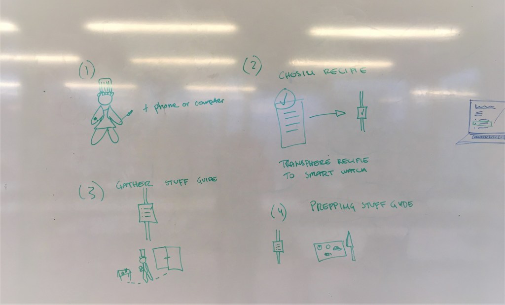
Our idea is to have the interface as an assistant that tells you what to do step by step when cooking a dish. You know when you want to prepare a dish for the first time, you google the recipe on your laptop, and then you have run to the laptop every time you want to check the instructions, the laptop might be on stand-by mode at that point, you have to “wake it up” with fingers and hands that are most probably greasy or covered in some ingredient? and almost all the cooking websites have the recipe in the far bottom and the ingredients on the top? this is how the idea came to us. We would like to have a glanceable interface that helps us in the cooking by giving us actions to do, according to the recipe. The interface gets connected to the laptop. The laptop is still available if we need any particular info on something, also all the steps are there, but we will use the smartwatch mainly, while cooking. The interface provides us with timers (time left for each step), the previous step, how far we have come in the process and how much is left. The main features that make the interface glanceable are the minimal animations together with the very short text on top.
We did a video prototyping mixed with bodystorming where one was the “cook” and one was saying the instructions to the cook with a few but meaningful words, we wanted to simulate the quality of glanceable feedback that is quick and understandable. Some points were gathered for further discussions, like when the cook feels the need to use her/his laptop, or the smartwatch giving ‘hints’ to the cook that are extra information that can be found on the laptop, or whether we have to have “scrolling up” to have more detailed information about certain things, which if were available on the main page of the interface, would have created chaos and/or confusion.
We are currently trying out different wireframes with different designs, inspired by the Apple’s “Human Interface Guidelines” (from a UI design point of view) and the points we gathered from the papers (conceptually).
References:
[1] Gouveia, R., Pereira, F., Karapanos, E., Munson, S. A., Hassenzahl, M. (2016). Exploring the Design Space of Glanceable Feedback for Physical Activity Trackers. In Proceedings of Ubicomp’ 16.
